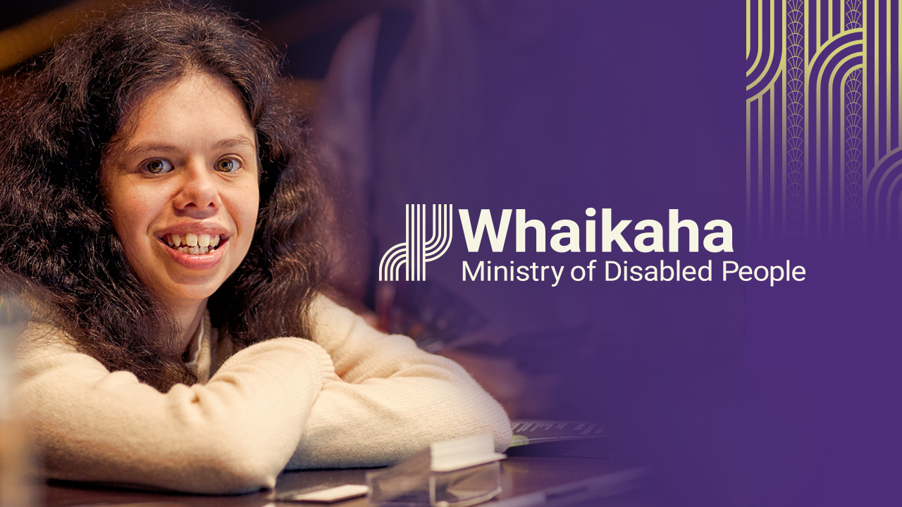
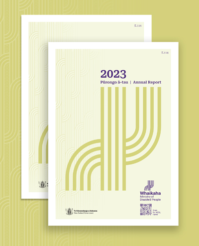
Whaikaha – Ministry of Disabled People
Brand development for the world’s first government ministry for disabled people.
Creating the brand identity for the world’s first ministry for disabled people, Whaikaha, was a massive privilege and challenge. With the most diverse range of audience needs imaginable, our journey saw us expand what we thought possible in inclusive design.
- Brand identity development
- Brand design system development
- Cultural messaging and design development
- Collateral design
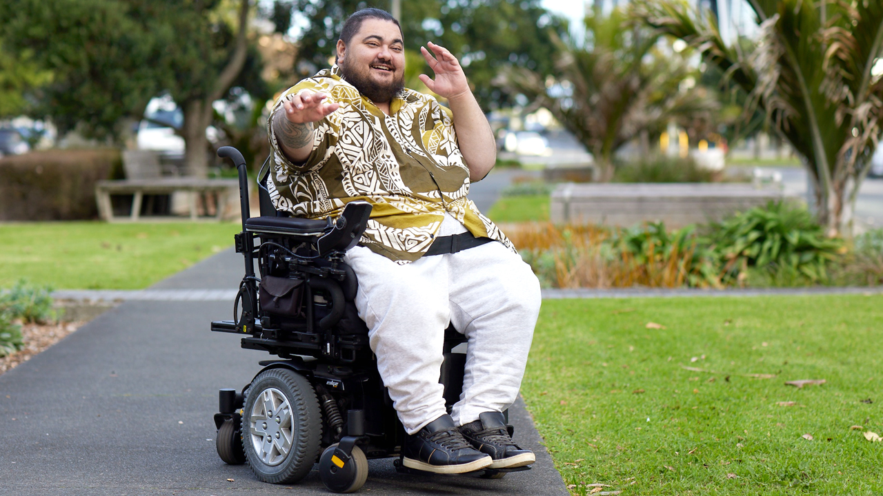
- Photography library development
Along with the diverse range of accessibility needs, a big consideration was the needs of whaikaha Māori – disabled Māori – and establishing a way for this ministry to engage in a culturally-inclusive manner, based on the core principles of Te Tiriti o Waitangi.
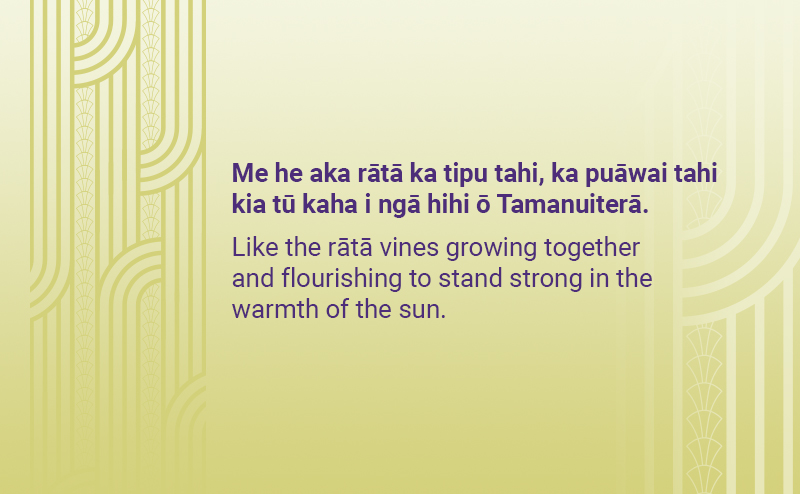
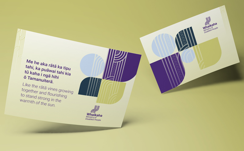
We developed whakatauāki to reflect the idea of two groups (disabled communities and the Ministry) growing together to stand strong in the warmth of the sun. Tohu design then brought this message to life visually.
Our logo graphic is a succinct version of the tohu design and its core message.
Another world-first for the Whaikaha – Ministry of Disabled People is the sign-language version of the brand identity, which is accessed through video, by way of QR code woven in to optional logo structures.
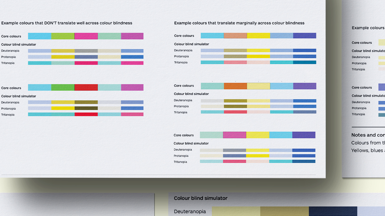
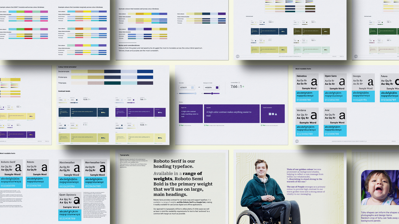
In our initial stages of design development, we explored a wide range of accessibility considerations, including our approach to cultural visual language as well as practical design considerations, such as our approach to colour (colour blindness and colour contrast requirements), exploring the world’s most readable fonts, and approaches to use of imagery. Our aim was to create a design system that combined the needs of optimal aesthetic appeal and inclusive, accessible functionality.
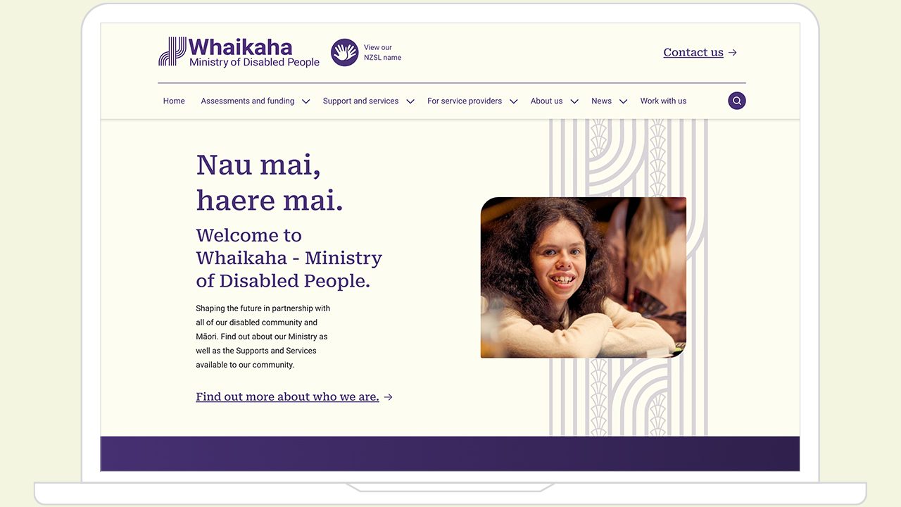
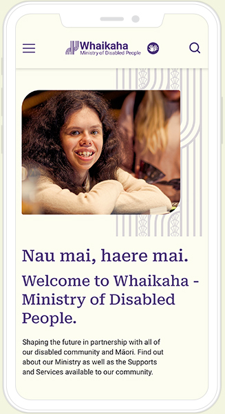
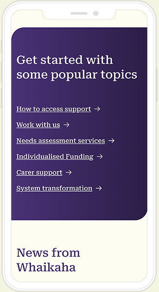
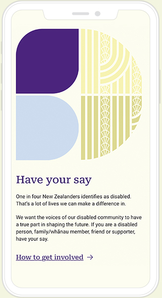
The Whaikaha website was brought to life by the team at AKQA, who interpreted the design system beautifully for the digital environment.
Optimal digital accessibility standards underpinned the entire website experience, from desktop to mobile site formats.
Our collective learnings have influenced much of our work since this project began and made us realise that the real beauty in design is not just in its form, but also in its function and how many people can access and enjoy it. It has also made us realise just how much opportunity our entire industry has to consider the needs of our communities with diverse needs.
“The work we did was quite controversial and fast paced. It needed intellectual rigour around accessibility and creative expression for disabled people. Stephen was very humble, demonstrated his research and made my job super easy.”
Victoria Smith
Business Development Unit, Whaikaha – Ministry of Disabled People


