Helping to create a more cohesive Aotearoa, New Zealand
Visual identity and collateral to help enable a more cohesive Aotearoa New Zealand, based on the Royal Commission Report into the 2019 Christchurch mosque attacks.
Following the Christchurch mosque attacks, the Royal Commission of Inquiry generated over 30 recommendations for various government departments. The Ministry of Social Development (MSD) led a comprehensive government-wide approach to social cohesion through community consultation, and developing and delivering a range of social cohesion products.
This visual identity system and subsequent resources were created to enable this initiative.
- Visual identity development
- Cross-cultural design development
- Collateral design
Our first step was to establish our core messaging platform.
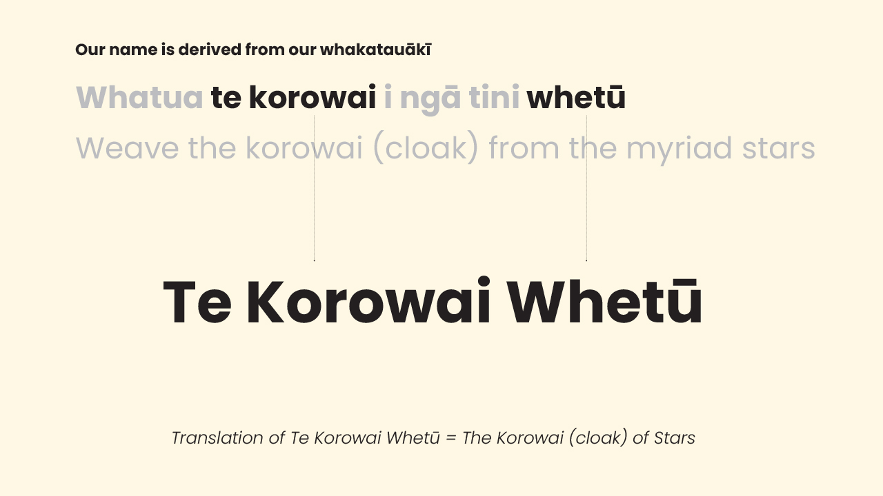
We referred to the very foundations that our country was formed on, and our the guidance we established to help enable us to live and thrive together – Te Tiriti o Waitangi.
Our core message has a duality that reflects Te Tirirti o Waitangi kaupapa – acknowledging both the rights of Tāngata Whenua (People of the Land) and Tāngata Tiriti (People of the Treaty.
In practice, this means that the messaging grows first from recognition of the whenua we live upon, the guardians of that land, then grows outward to include and embrace all cultures of Aotearoa. The resulting work is built upon the universal values of kaitianga/care, mana/respect and whanaungatanga/inclusion.
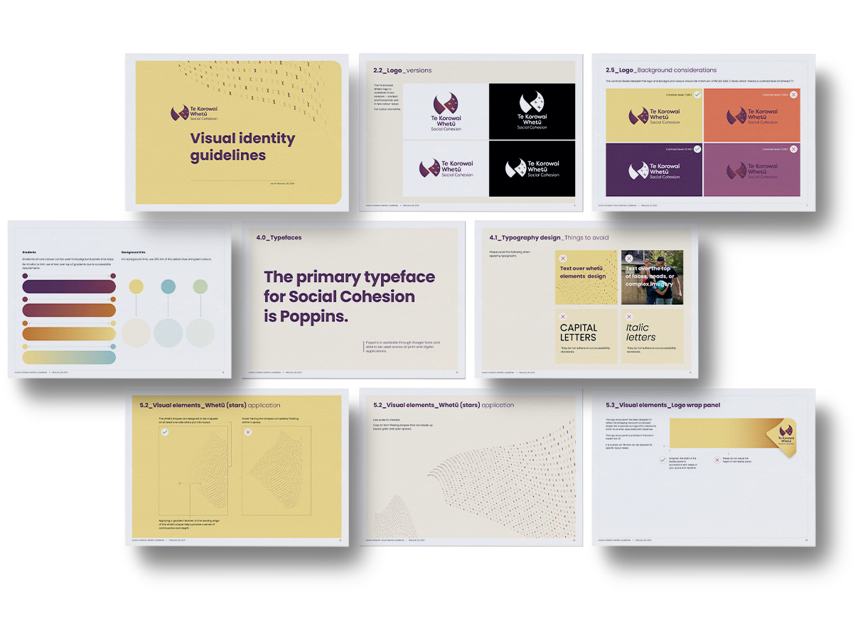
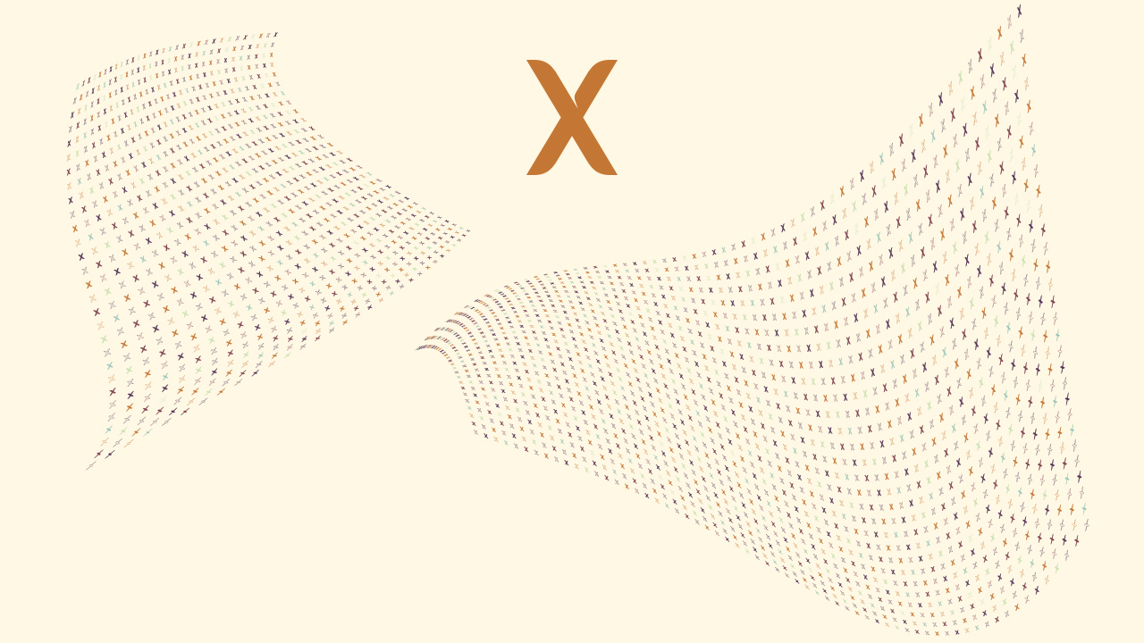
Our core logo graphic is a visual representation of our core messaging.
Our single whetū element represents an individual person and the whetū imagery forms the basis of our core messaging. The flowing whetū patterns – reflecting the ideas of diversity, inclusiveness and a flowing korowai (cloak) – provide a backdrop to our visual identity system.
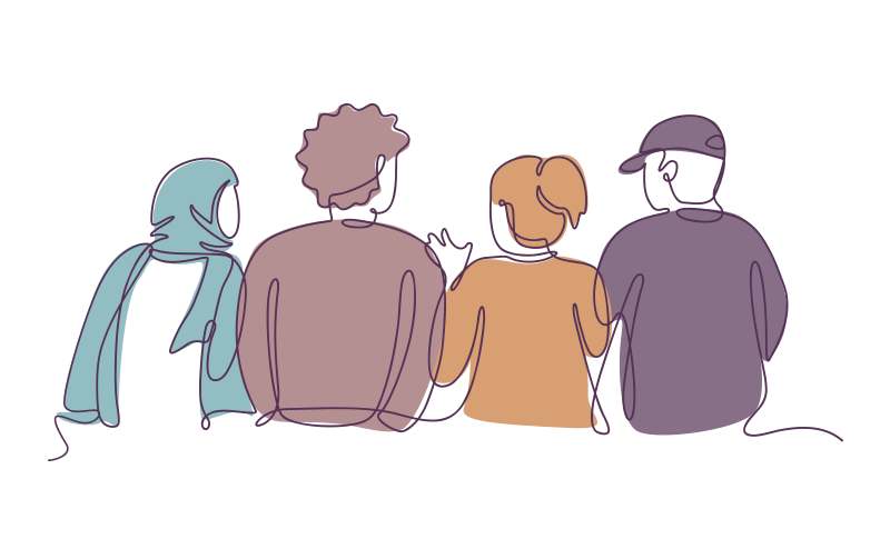
Our brief for imagery creation was very tight and was not able to include photography. We wanted to create imagery that reflected inclusiveness, warmth and whanaungatanga (connection), and also struck a balance between being descriptive and neutral. Our answer came from an approach to illustration that reflects a group of people who could belong to a wide range of ethnicities, ages and communities, and uses one continuous, connected line to create the entire image.