Nuku Ora
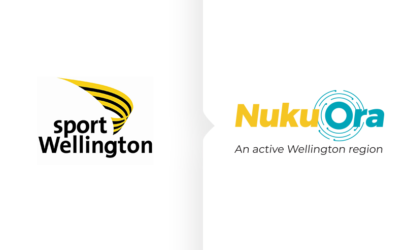
Former Sport Wellington rebrand
Helping enable the Sport Wellington brand to grow and operate beyond sport.
- Brand positioning
- Brand identity
- Cross-cultural communications and design development
- Brand identity application design
The name Sport Wellington centred the organisation in the sports context, being mostly defined by competition, structure and scoreboards. But the community need was growing beyond a focus on sports. Being able to encourage all forms of physical activity, that lead to healthy people, whānau and communities had become an integral part of what the organisation needed to deliver.
We worked with Sport Wellington to help identify the things that would get in the way of their strategic intent and set about developing a new way of representing the organisation that was more connected to the communities it serves and reflective of the work is does now and plans to do in the future.
We worked with local iwi/mana whenua to understand the connection between physical activity, our region and our people.
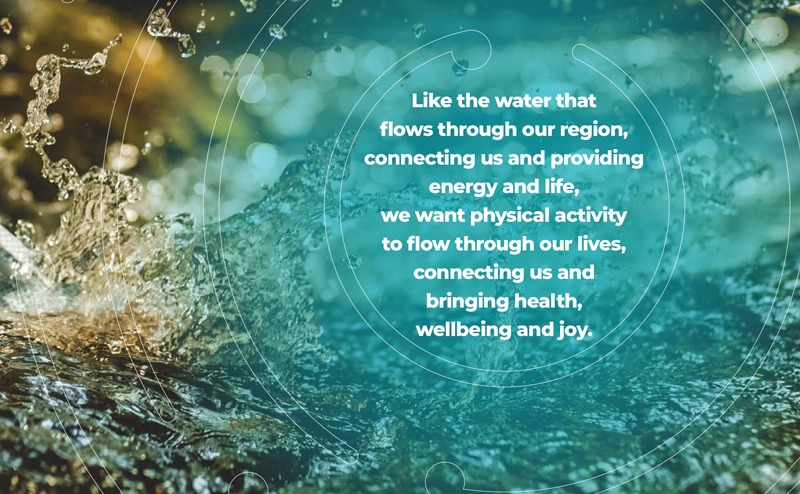
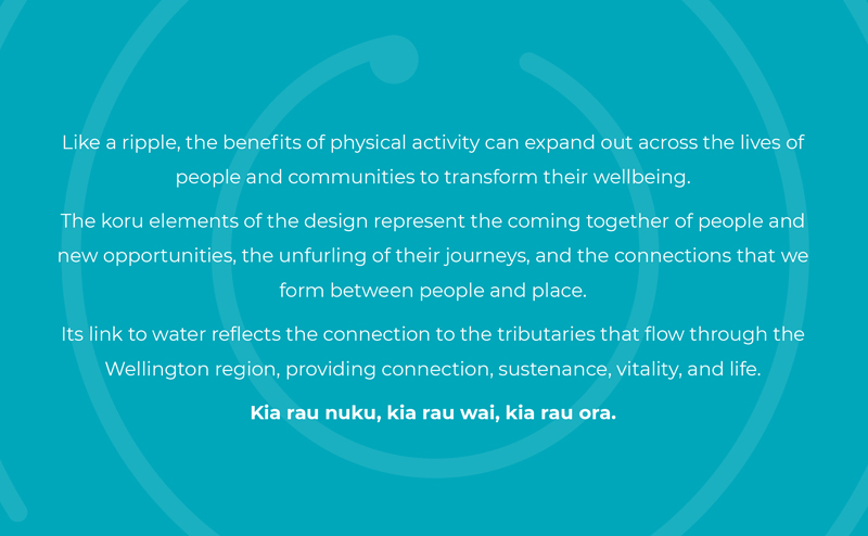
We got to understand the importance of the waterways and tributaries that flow throughout the Wellington region, to connecting, converging and carrying sustenance, energy and life. The importance and value of our waterways have become a metaphor for how physical activity can also flow through our communities, providing sustenance, energy and life.
Through this process we developed a whakatauakī:
Kia rau nuku, kia rau wai, kia rau ora.
Through physical activity and water we can transform the wellbeing of our people and communities.
Our whakatauakī led to Sport Wellington’s new name: Nuku Ora – meaning Active Life.
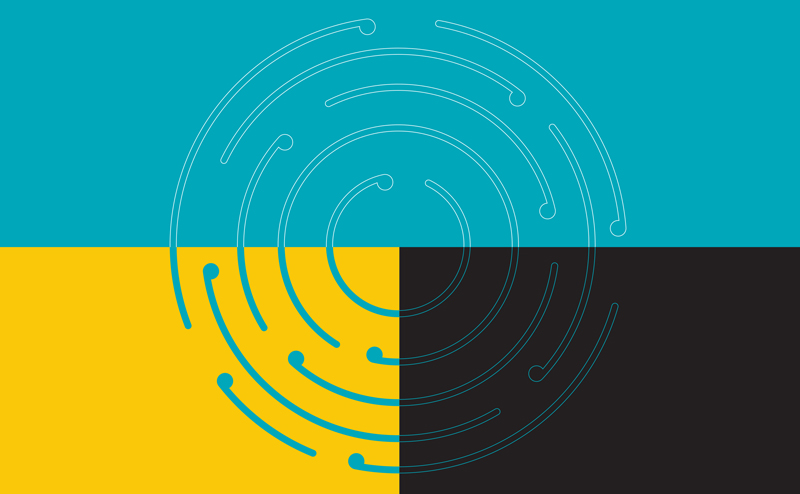
A key aspect of the brand is the Nuku Ora Ripple Effect – the idea that when we touch one person, the benefits can ripple out across whānau, friends and communities.
The re-imagined brand positions Nuku Ora as the organisation who can help all Wellington region people and communities thrive through all forms of physical activity.
“We were so impressed with Stephen’s input and expertise that once the board confirmed that the rebrand should go ahead, we contracted Stephen to lead us through the process. During the 12 months that we worked with him, Stephen was always professional, approachable, and accommodating. With his guidance and attendance at meetings with staff, the board, our stakeholder reference group, working group and Te Amokura, the process was well thought out and participants often commented on how smoothly it was all going. We are very happy with our new name, our whakataukī, logo, and visual identity, all of which is backed by a story that our staff are proud to tell. I would highly recommend using Stephen and Ramp Brand Communications.”
Kirsten Kilmister
Rebrand Project Lead, Nuku Ora (formerly Sport Wellington)